


Directions: Read each question below. Select your answer by clicking on the button to the left. Feedback to your answer is provided in the RESULTS BOX. If you make a mistake, choose a different button.
1. Mrs. Glosser's class voted on their favorite type of toy. Each student voted once. Here is the vote: doll 4, action figure 4, educational toy 3, video game 6, electronics 5, building blocks 1. Which of the following bar graphs shows all of these facts correctly? (Note that the title of each graph has been omitted.)
2. An infant's weight was recorded in pounds for each of 7 weeks. Here is the data: Week 1: 7.5 lbs; Week 2: 7.1 lbs; Week 3: 7.4 lbs; Week 4: 7.7 lbs; Week 5: 8.2 lbs; Week 6: 8.6 lbs; Week 7: 9.0 lbs. Which of the following line graphs shows all of these facts correctly? (Note that the title of each graph has been omitted. Also, the value for each point has not been labeled.)
3. The amount of time spent on daily activities is given in hours as follows: School 8, Sleep 6, Entertainment 5, Homework 3, Meals 2. Which of the following circle graphs shows all of these facts correctly? (Note that all titles have been omitted.)
| 4. | What kind of graph would you use to represent the speed in km per hour of the world's fastest 20 animals? |
| 5. | What kind of graph would you use to represent the annual number of vehicle fatalities in your state for the last 10 years? |
| 6. | What kind of graph would you use to represent the number of Internet users in 10 different countries? |
| 7. | What kind of graph would you use to represent the percentage of students in your school by grade level? |
Refer to the line graph below to answer Exercise 8.

8. What is wrong with the line graph above?
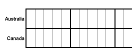
Refer to the bar graph below to answer Exercise 9.

9. What is wrong with the bar graph above?
Refer to the circle graph below to answer Exercise 10.

| 10. | What is wrong with the circle graph above? |

